Ammon Ngakuru
Pumice
16 April - 15 May 2021
Ammon Ngakuru
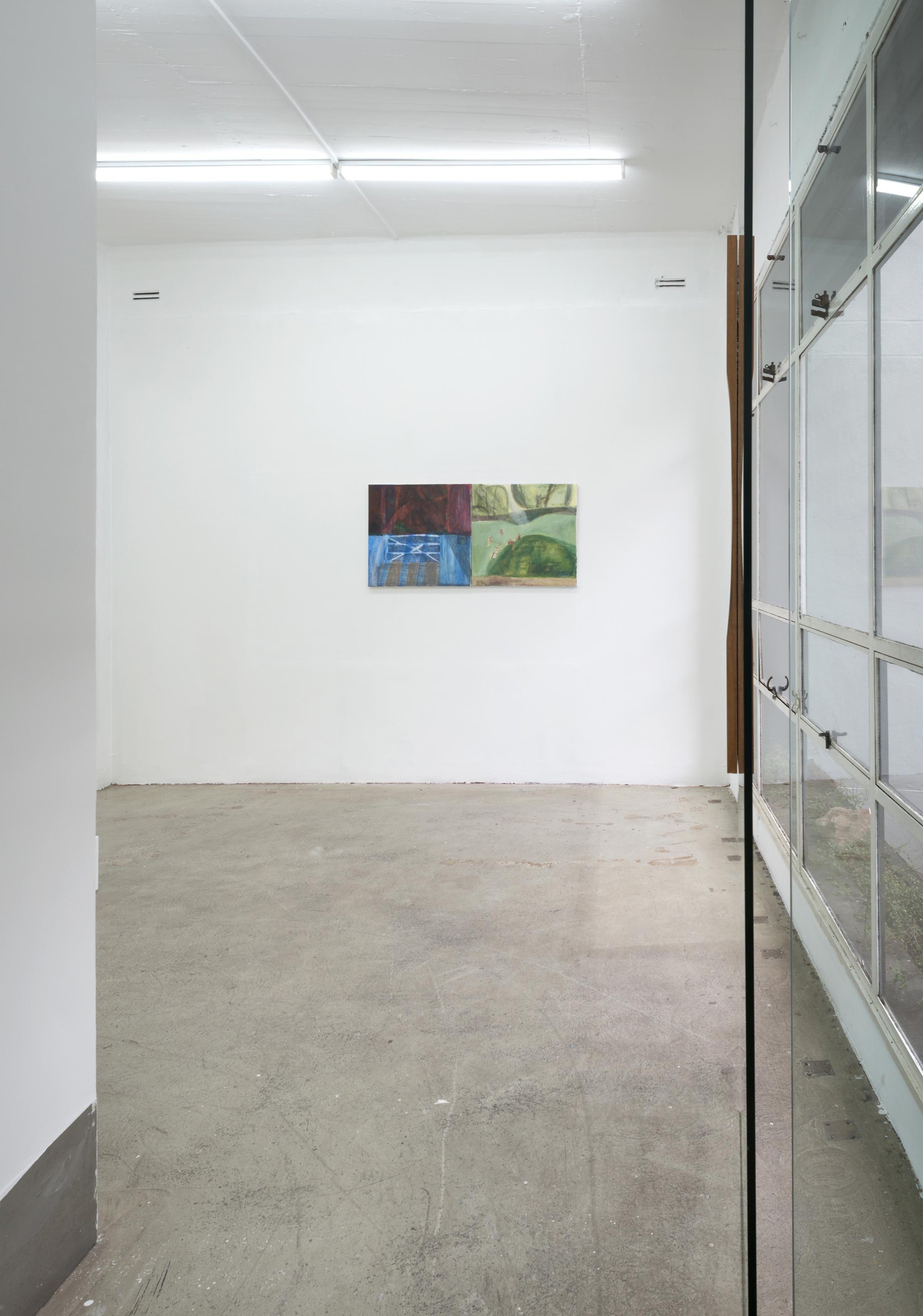
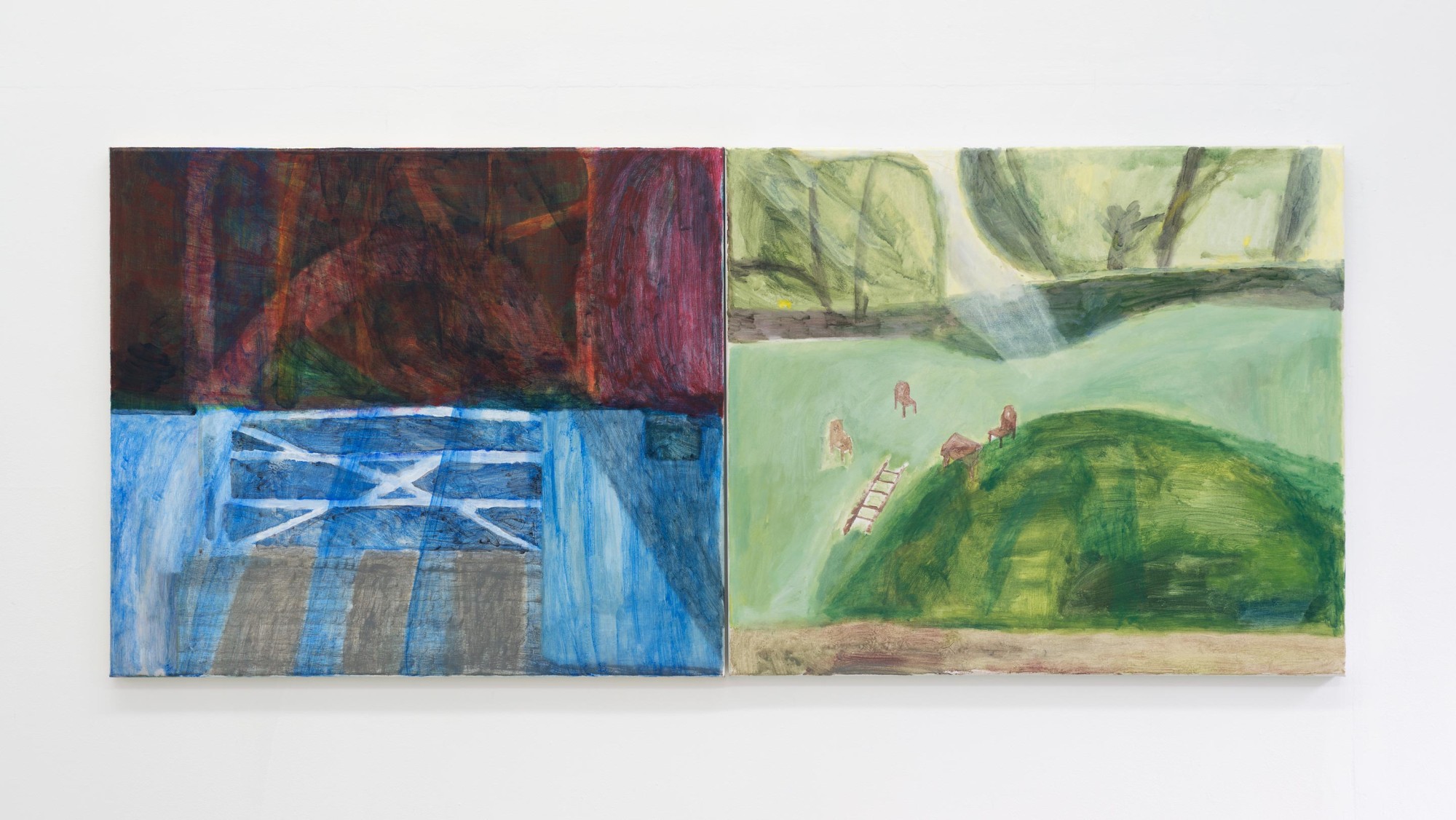
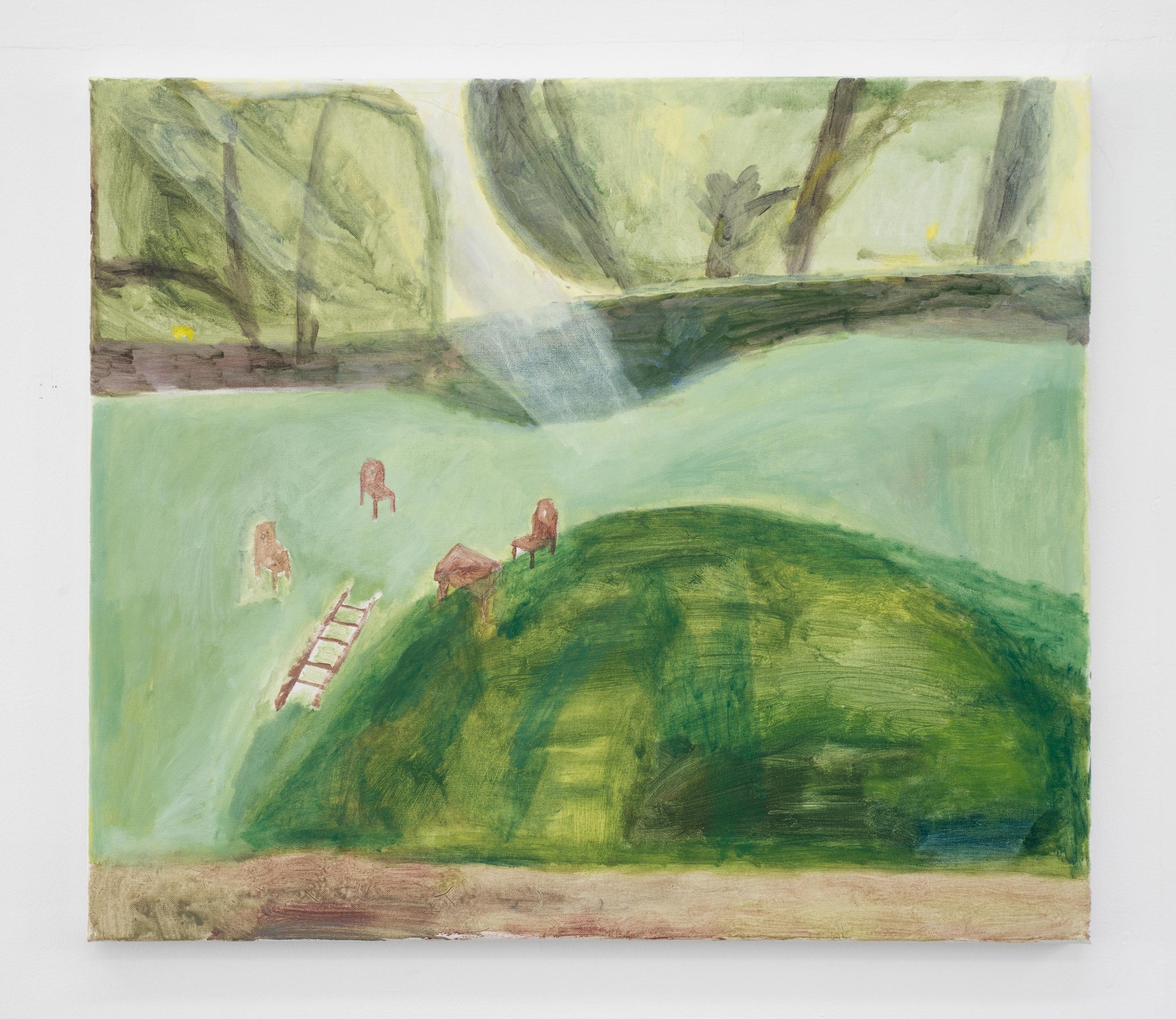
Aviary (gate), 2021
acrylic on canvas
600 x 700mm
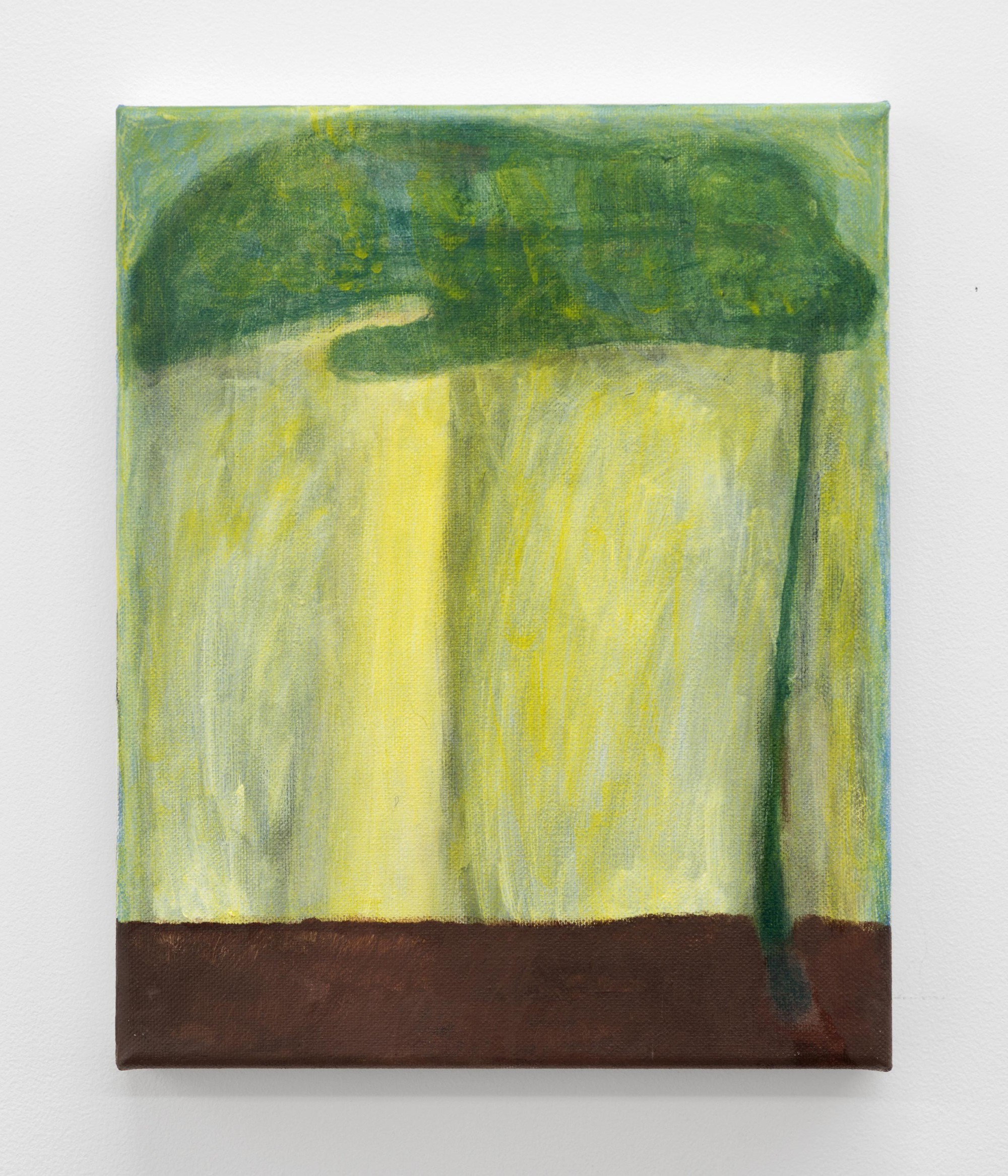
Evergreen, 2021
acrylic on canvas
600 x 700mm
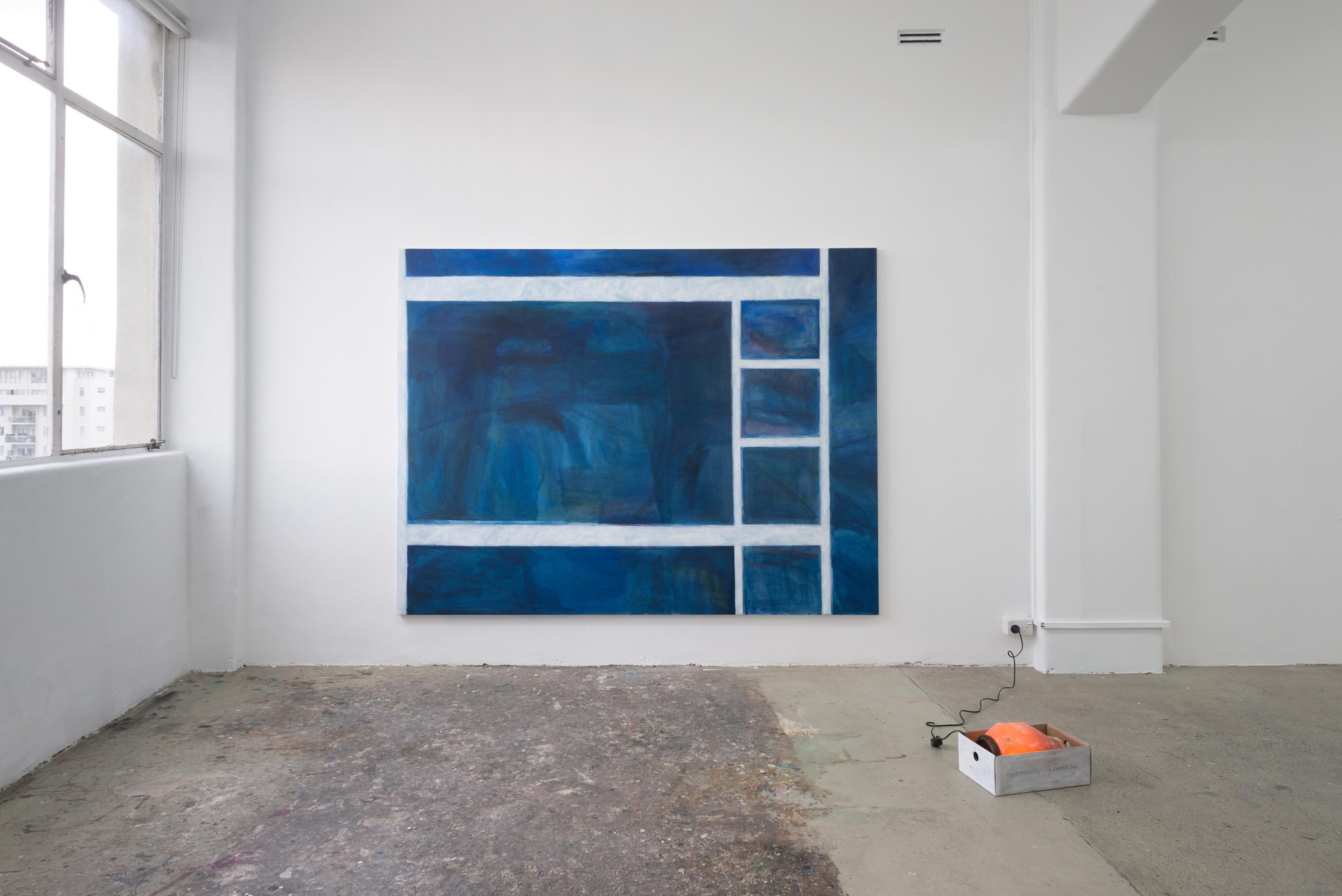
Ammon Ngakuru
Primary, 2021
acrylic on canvas
1700 x 2250 mm
Ammon Ngakuru
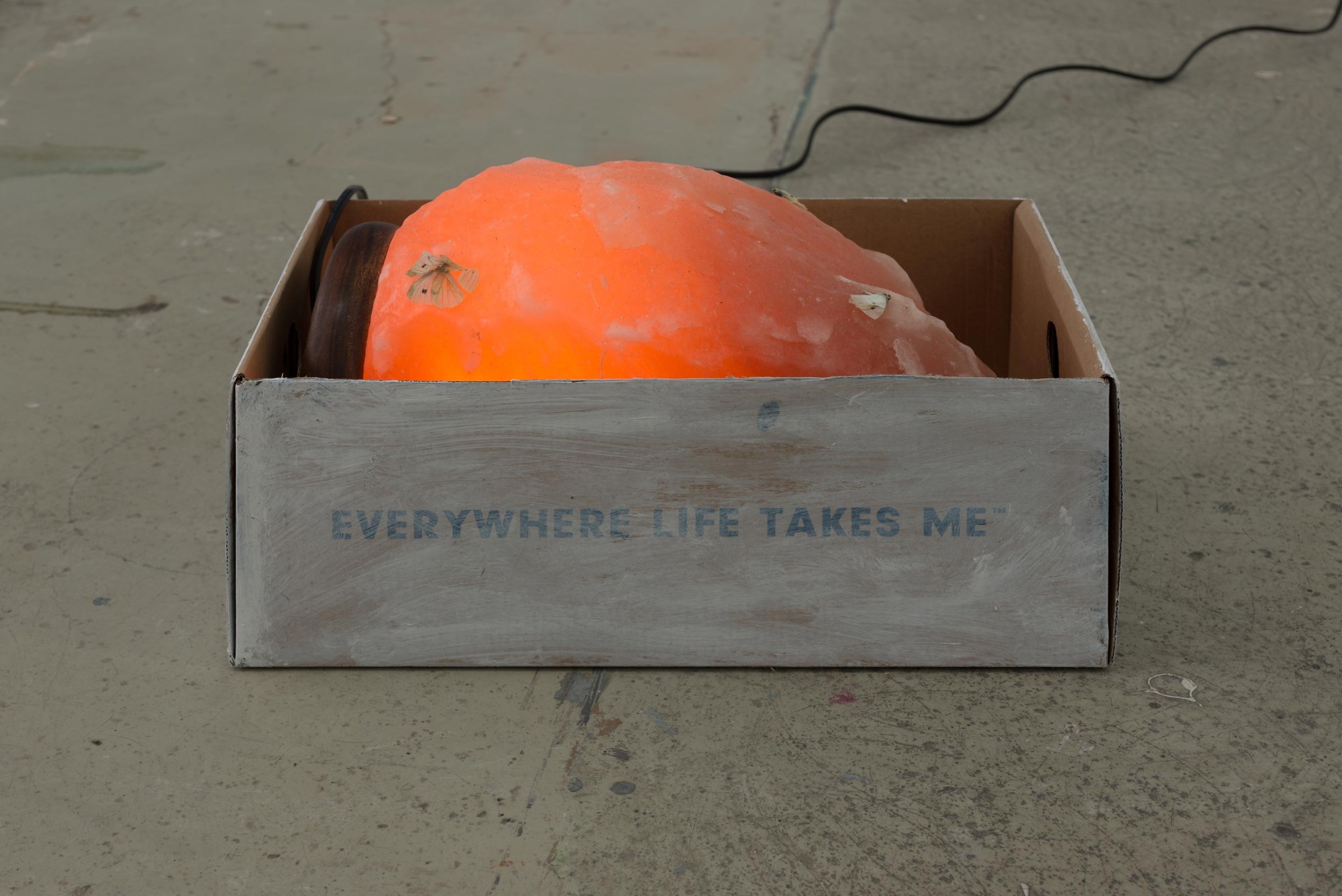
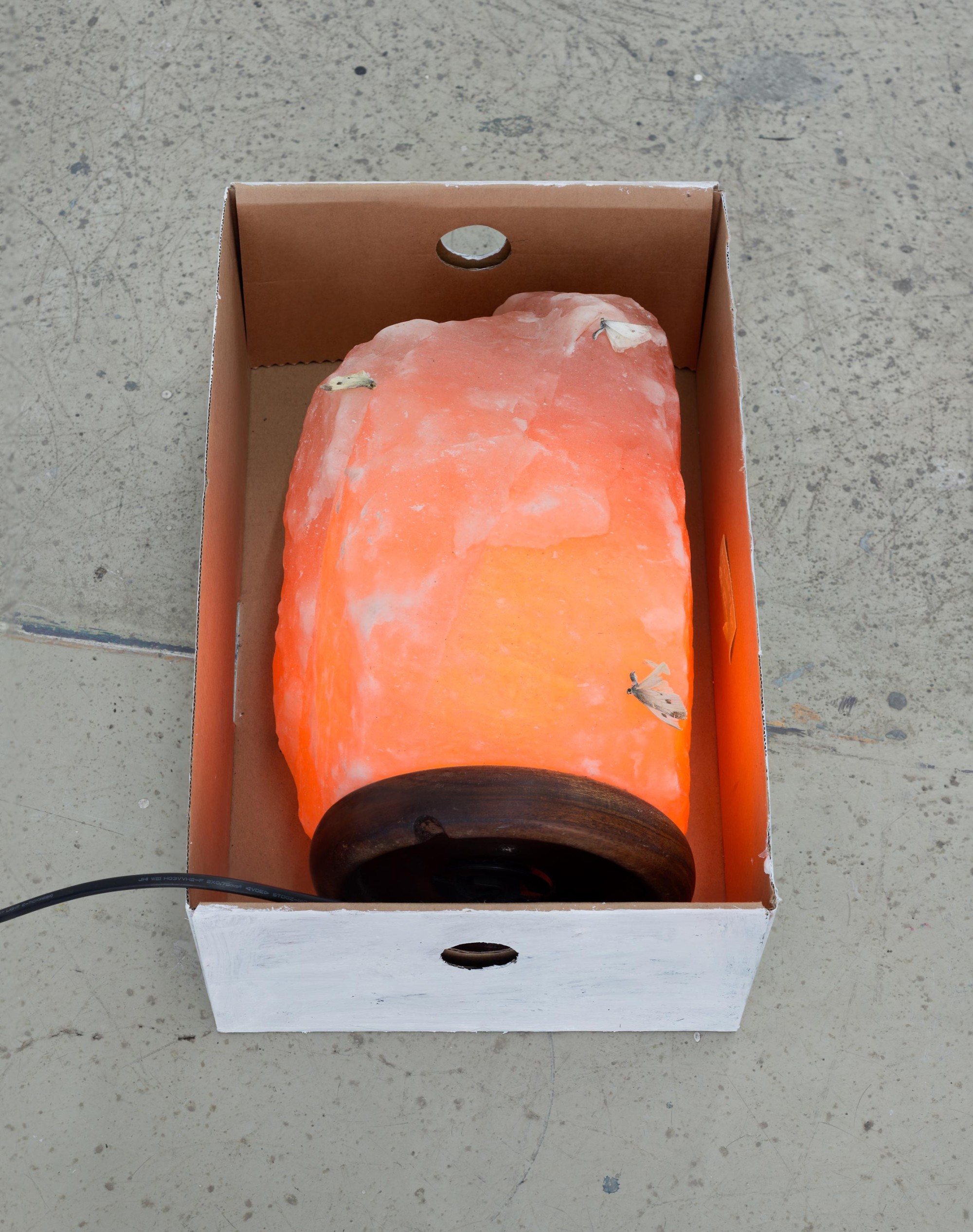
Real Food, 2021
salt lamp, box, acrylic, cabbage butterflies
200 x 340 x 220mm
Ammon Ngakuru
Pisces, 2021
acrylic on canvas
250 x 200 mm
Ammon Ngakuru
Real World, 2021
acrylic on canvas
250 x 200 mm
Ammon Ngakuru
Mill, 2021
acrylic on canvas
250 x 200 mm
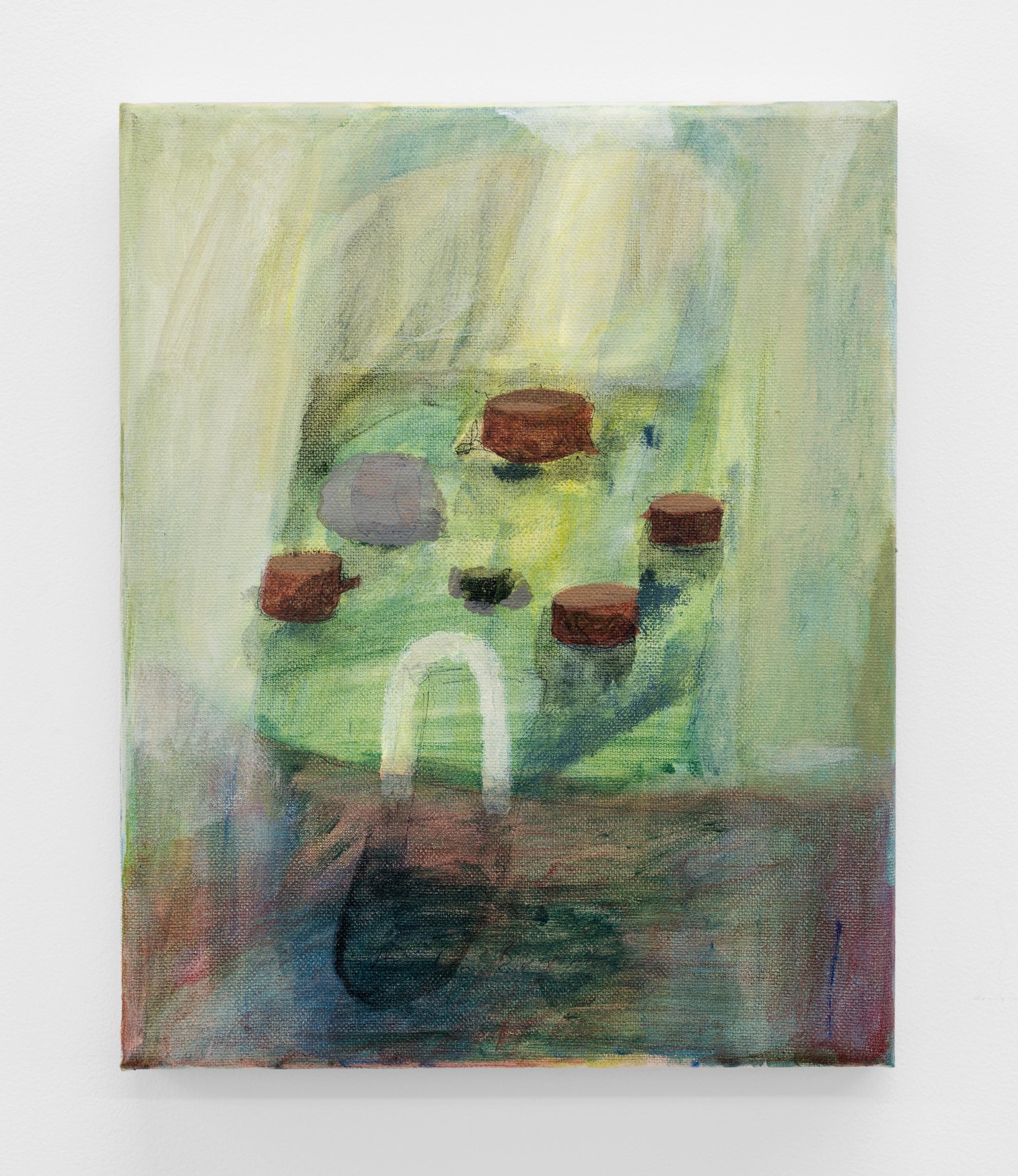
Ammon Ngakuru
Pumice, 2021
acrylic on canvas
250 x 200mm
Ammon Ngakuru
Small Fire, 2021
acrylic on canvas
250 x 200mm
Ammon Ngakuru
Kindergarten, 2021
acrylic on canvas
250 x 200mm
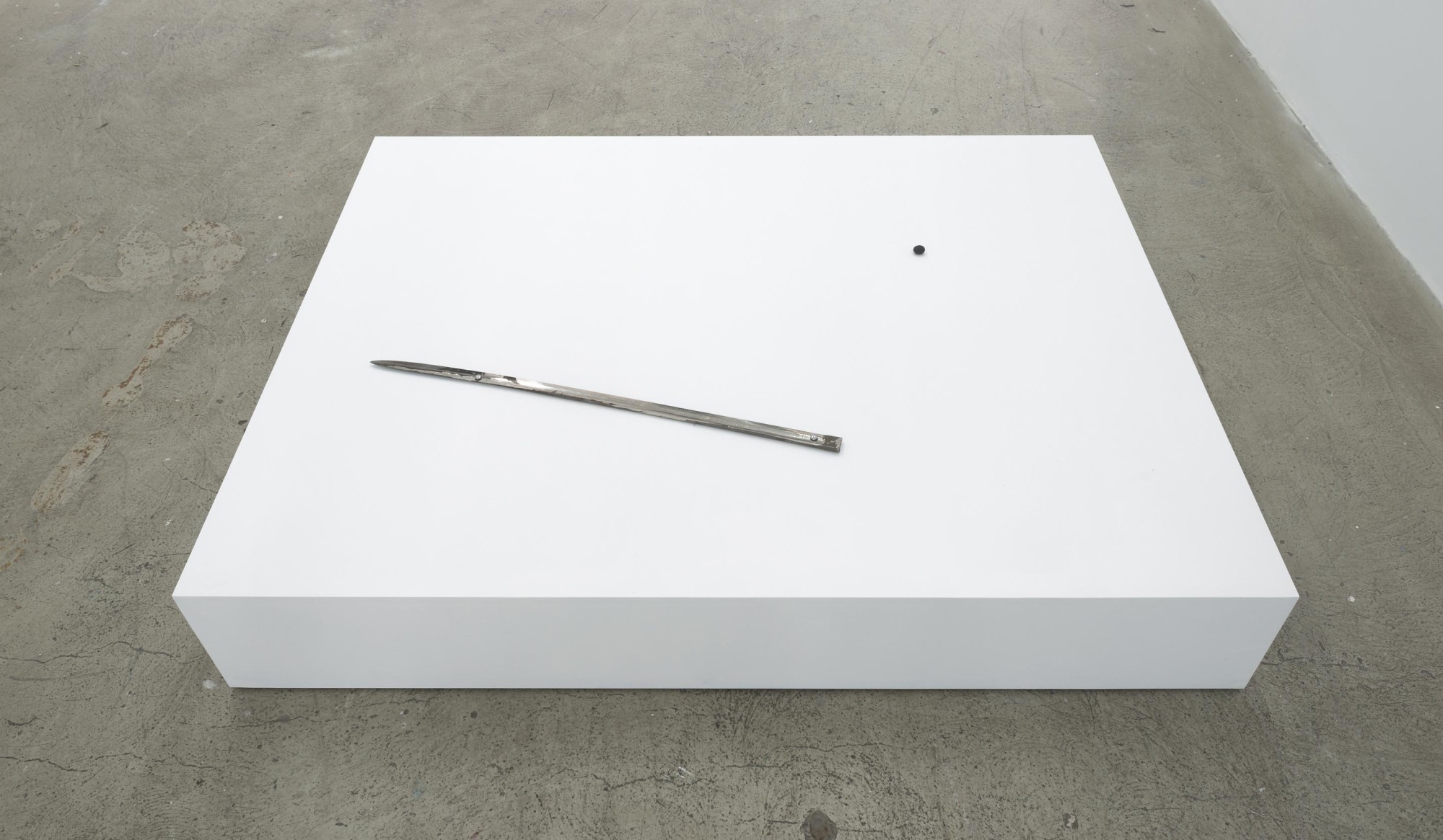
Ammon Ngakuru
Silver (my slow response), 2021
sword, rock, plinth
240 x 1220 x 1600mm

Ammon Ngakuru
Silver (my slow response) (detail), 2021
sword, rock, plinth
240 x 1220 x 1600 mm
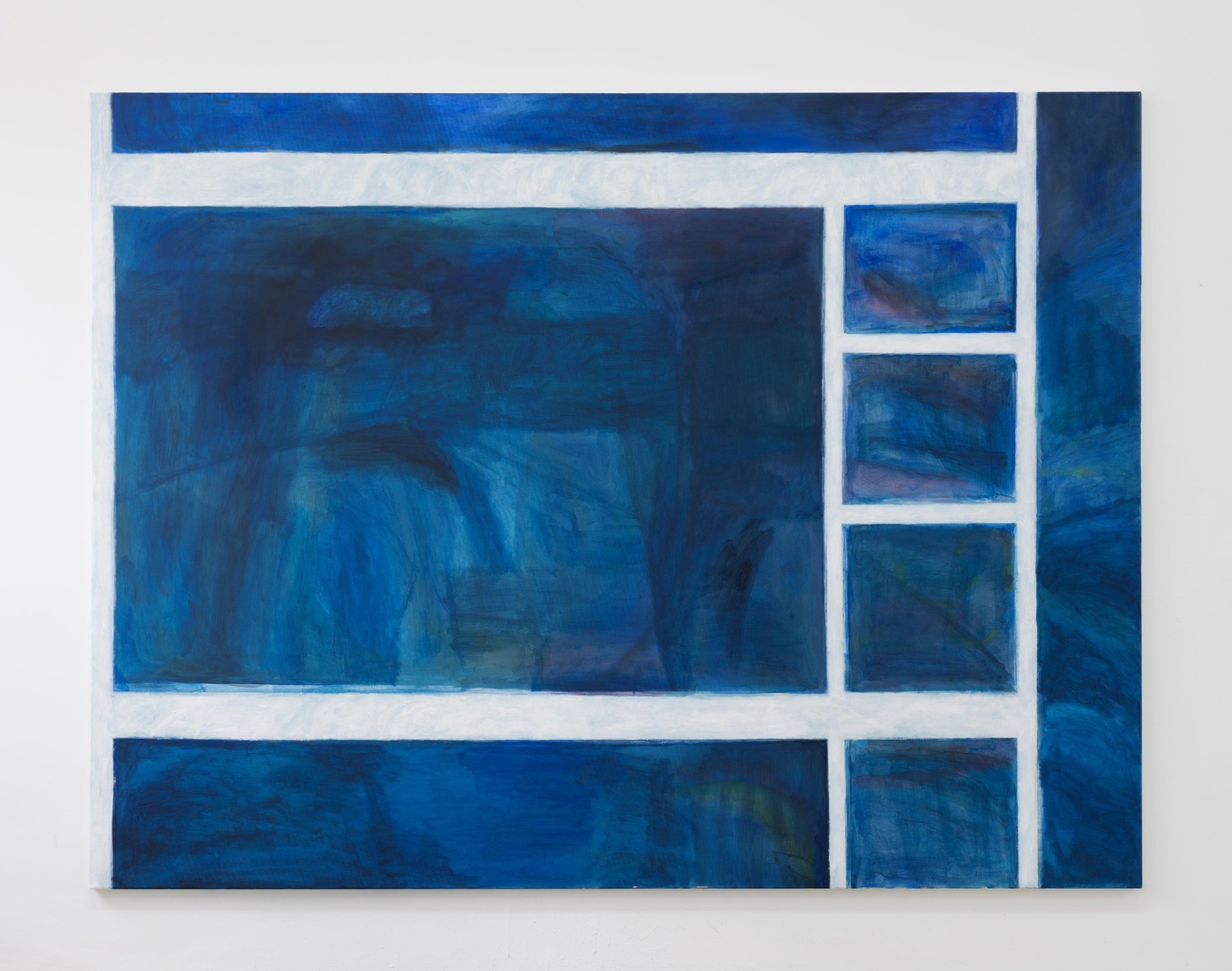
Ammon Ngakuru
Primary, 2021
acrylic on canvas
1700 x 2250mm
Pumice by Shiraz Sadikeen
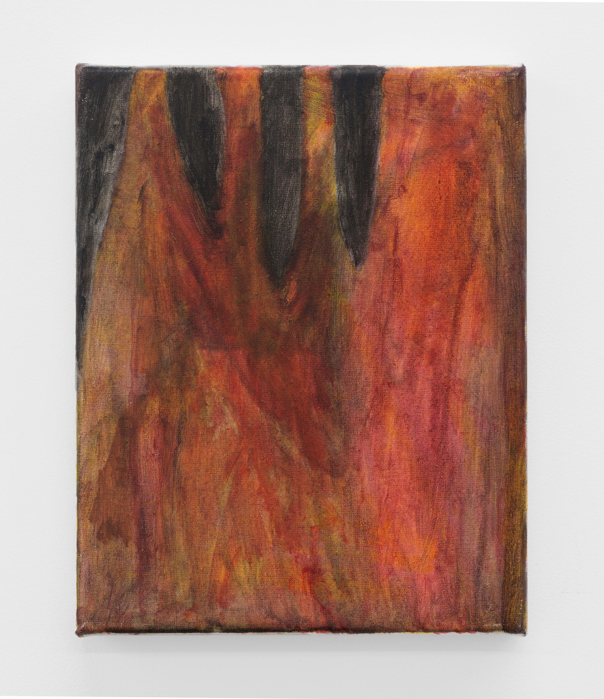
What most interests me in Ammon's paintings is their ambiguity. His basic procedures – quavering strokes that describe loose, simply rendered forms, often scumbled over with slightly opaque washes, layered with semi-transparent glazes, or set in open passages of soft, tonally muted colour – result in a degree of representational indeterminacy that never dissolves into complete abstraction. Instead there's a consistent buffering of the legibility of the works' ostensible subject matter - a textural and tonal fraying that slows one’s recognition of what might otherwise cohere immediately in perception.
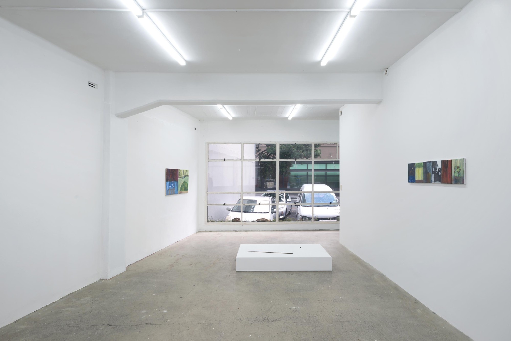
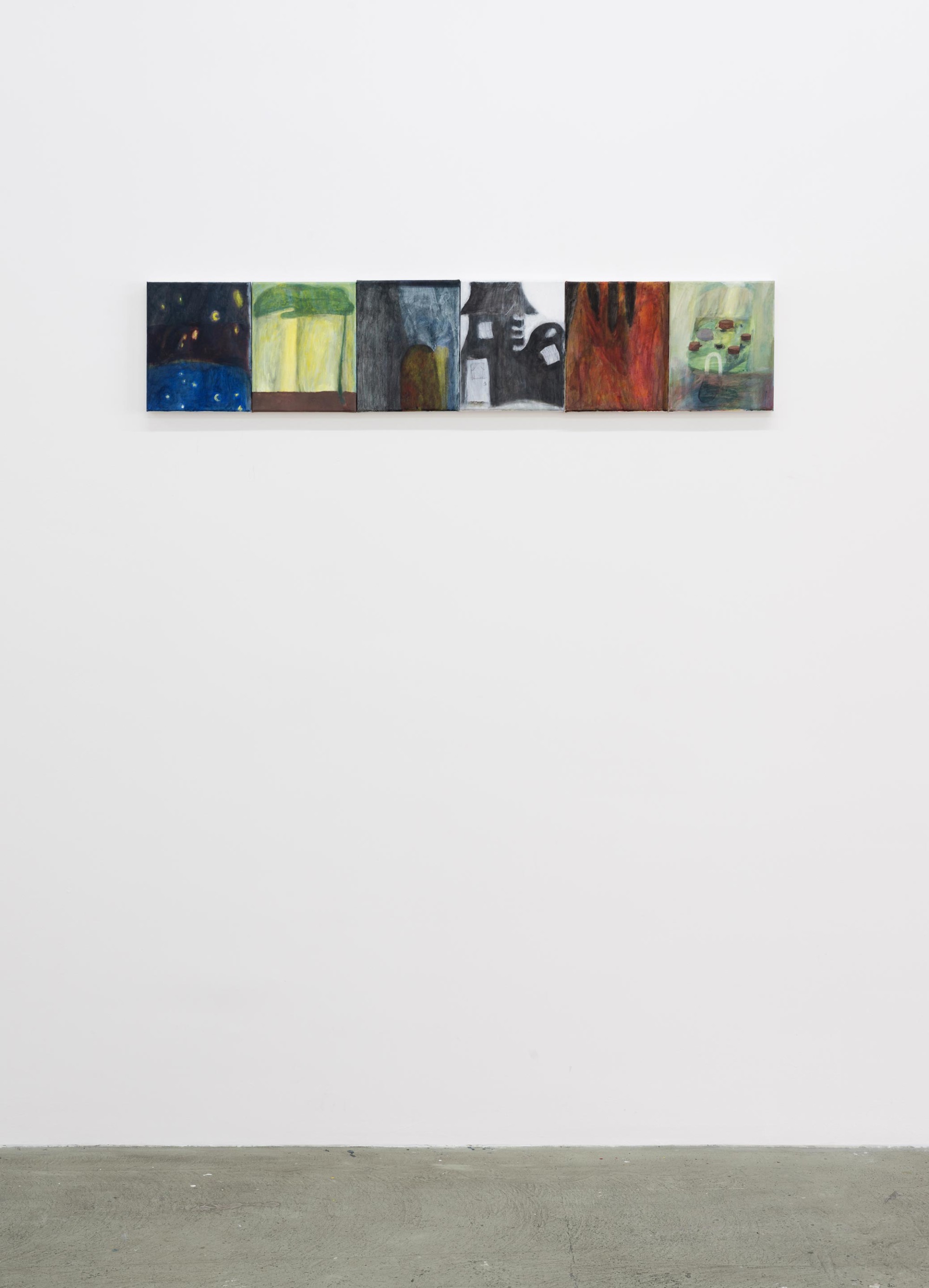
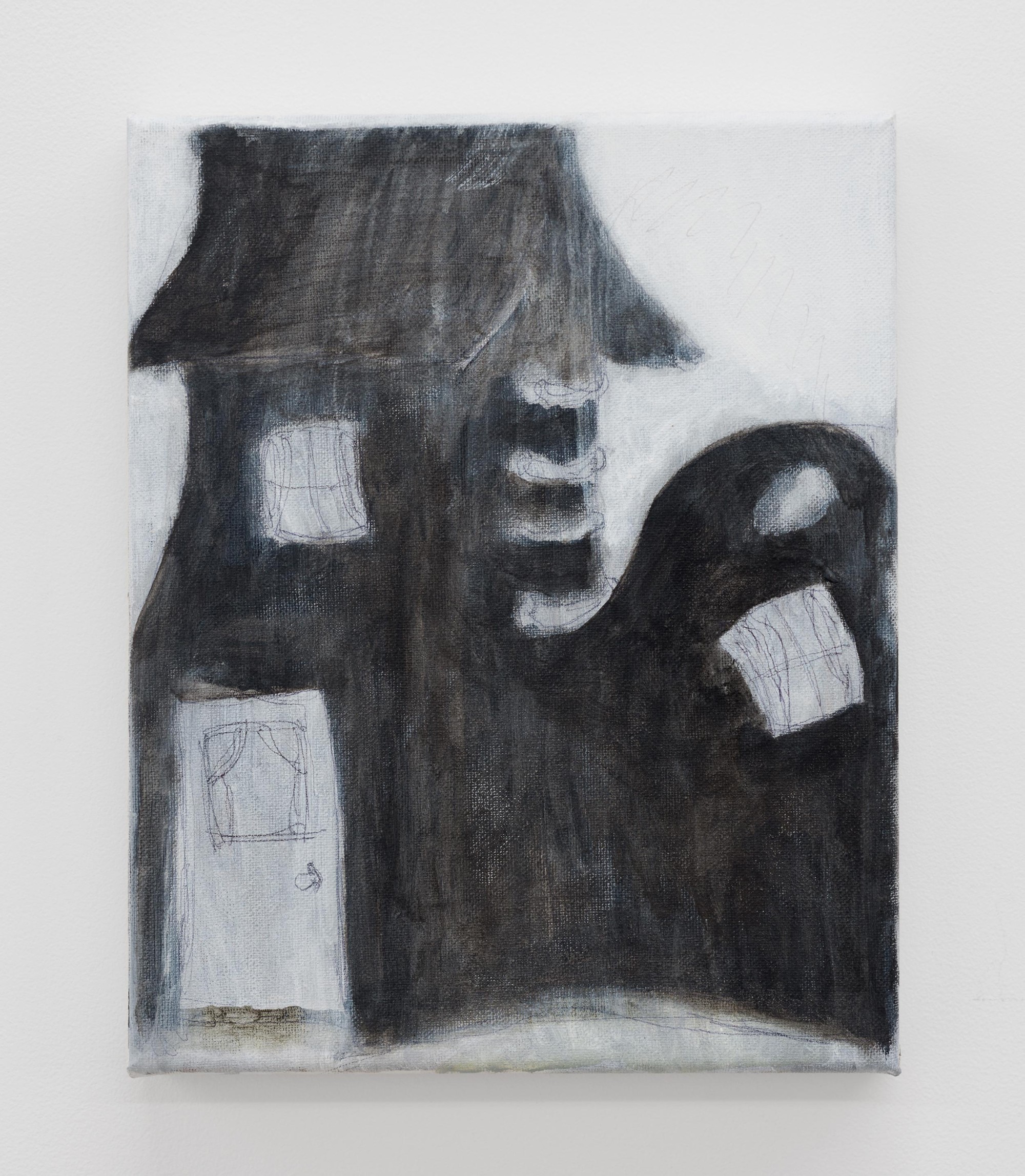
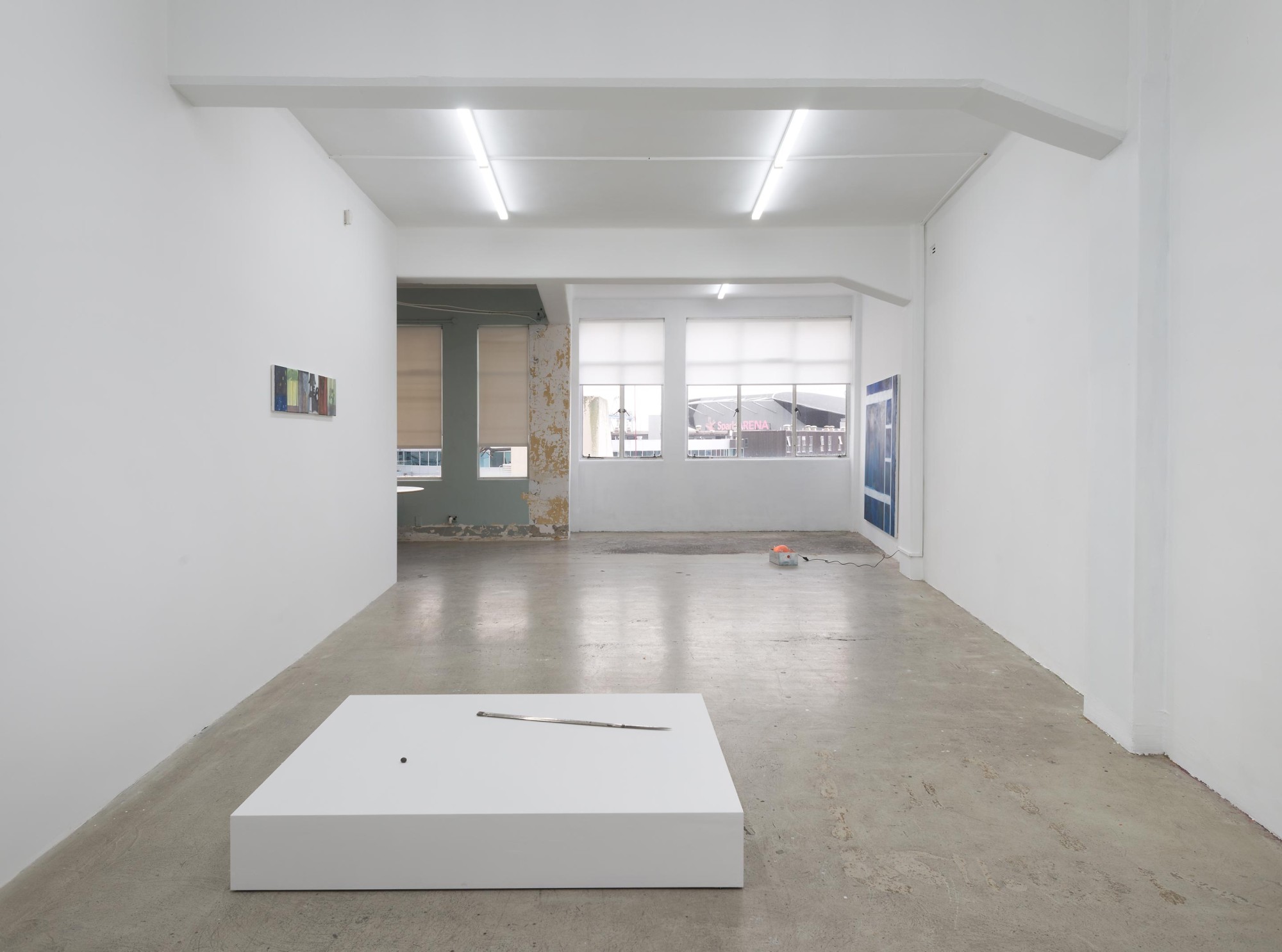
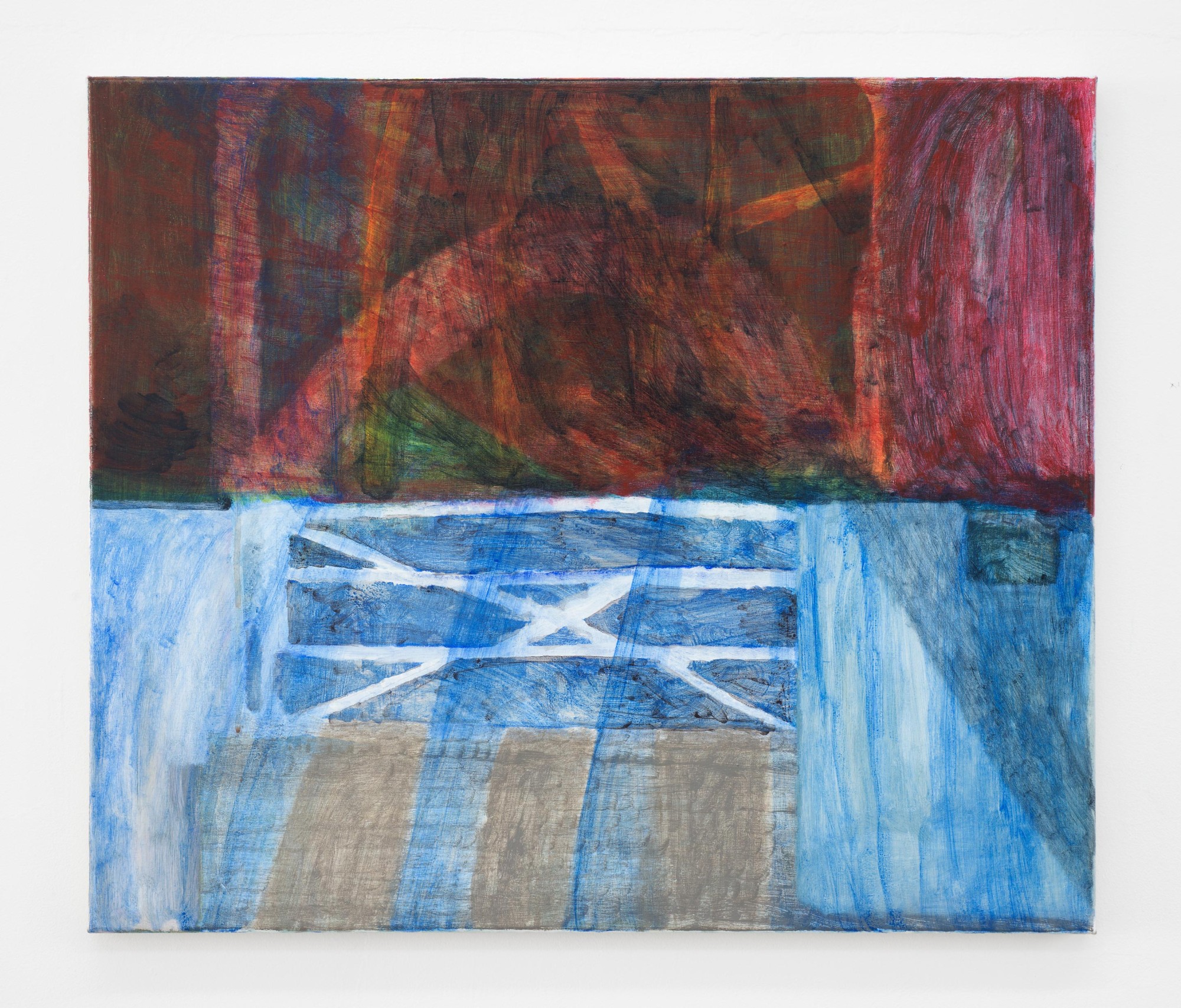
In the row of six small scaled paintings and in the diptych you first encounter entering the exhibition space, these painterly occlusions of referentiality work in complementary tension to the works' manner of installation, where, articulated at their edges, each picture functions as a panel organised within a vague narrative sequence.
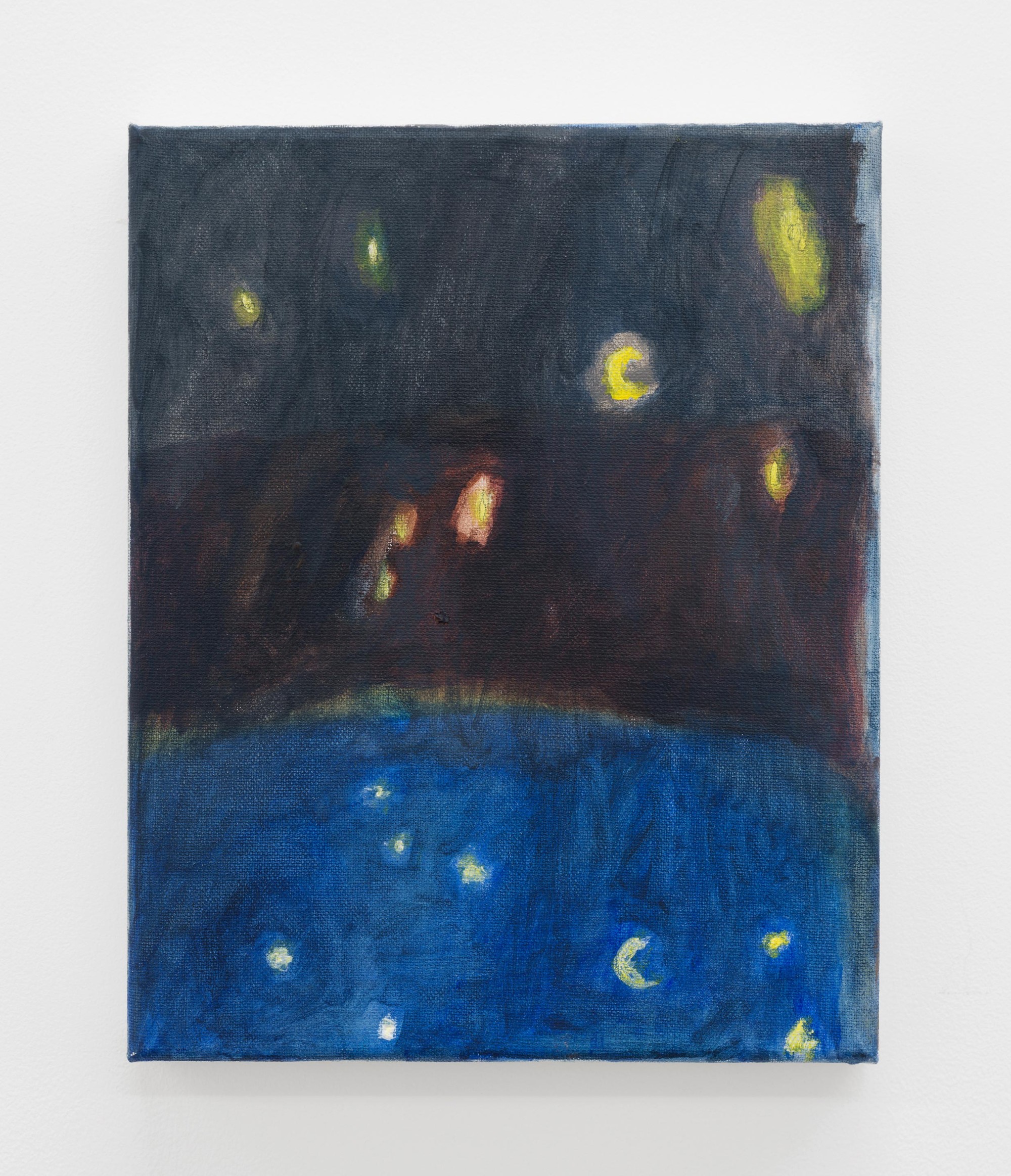
The series of small paintings for instance seem to be thematically concerned with childhood, alternating in a night and day rhythm towards Primary, the large painting hung at the far end of the gallery, that suggests a dreamy night-time landscape, seen through the abstracted profile of a bunk-bed.
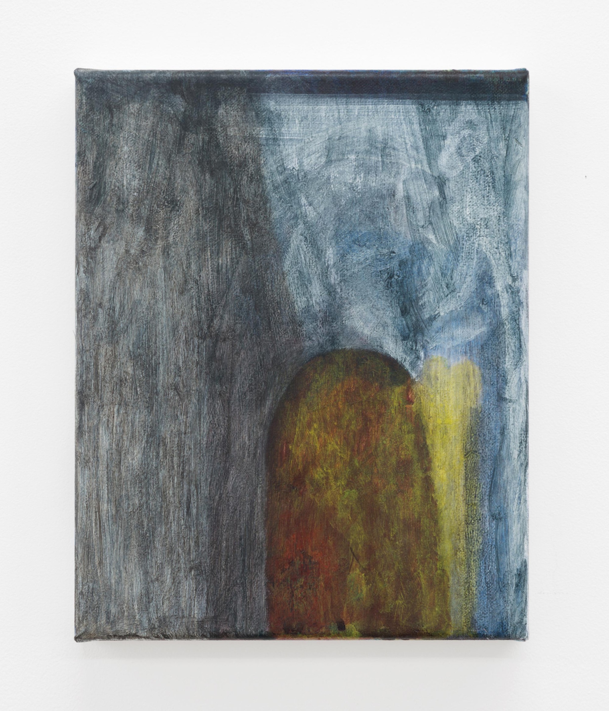
Within this series, Pumice seems to be a key painting, sharing its title with the exhibition. In it we see a sketchy, grey toned depiction of a goofily proportioned shoe that doubles as a house, referring the viewer back to an old nursery rhyme; 'There was an old woman who lived in a shoe'. Do a cursory search online about the poem and you'll find interpretations that ground its evocation of deprivation and a mother's tough love in the context of 18th century British imperialism.
Perhaps there's an analogy being made here between the violent tectonic forces that form pumice – familiar to most people as an exfoliant and soil supplement – and the genealogy of political and economic forces that condition seemingly innocent Anglo-cultural inheritances like this nursery-rhyme. The lightness of the image carries a weight of social implication that can only be accessed through pursuing interpretative connections that exceed what's immediately legible on its surface, a sense that’s complicated by the tastefully gestural treatment with which it is constructed. As an object, pumice symbolises this tension through the particularities of its material structure. Technically a kind of opaque glass – the cooled froth of a lava flow – its form is the materialisation of dynamic forces that are concealed in its everyday appearance and use.
When I asked Ammon about the formal treatment typical of these works, he answered with a practical straightforwardness, describing his method as a way of covering up his 'mistakes'. I thought this was significant, as it disclosed a connection between the sensibility of the artist intervening to 'correct' his paintings and this softening of their representational content, tempered by painterly atmosphere or 'mood'. It’s through this partial negation of legibility that an expressive equivocation between the charm of their tonally harmonic fracture and their hazily withdrawn 'content' is constructed.
This tension carries over into the two sculptures on view. In Real Food Ammon continues his development of a formal procedure he explored in Cutouts, his show at Enjoy last year, in which he placed found objects in boxes that each framed and indexed a specific aspect of either the contemporary artistic field, the labour of his gardening day-job or a trendy commodity drawn from the milieu of the 'cultured' middle class. In Real Food his treatment and articulation of the elements that constitute the work synthesize these sites of concern in a single object, co-ordinating them with the addition of a subtle reference to New Zealand's colonial history.
Real Food is comprised of a lit Himalayan salt lamp that’s been turned on its side, its glowing pink crystal adorned with dead white butterflies and placed within a Blundstone shoe box (for a pair of the artist’s work boots). The shoebox – branded with a trademarked and suitably rugged life affirming motto on its side– is partially obscured with gestural white paint.
The shoebox’s function as a container and framing device that grounds and supports the lamp, links the prosaic labour of Ammon’s day job as a gardener with the sublimating artistic labour of its symbolic and aesthetic construction. His painterly obfuscation of its distinguishing marks reflect and subtly indicate the constitutive repression of the ‘real work’ that forms the material basis for the production and reception of such a ‘fetishized’ art-object.
The lamp itself, partially de-functionalised through its placement, comes weighted with the promise of bogus homeopathic health benefits, which, in the absence of belief in their efficacy, resolve the object’s function into something merely aesthetic; the provision of a pleasant warm glow. Perhaps this too is indicative of art’s sad fate; the discursive claims for which often terminating in agreeable objects and inconsequential pleasantries. The prettily arranged white butterflies that rest on the lamp’s surface are themselves split between a certain twee charm and the fact of their being an introduced pest from Europe, their tiny corpses desiccating from the effects of the salt and the heat that radiates through it.
Silver (My slow response) takes a different approach to Real Food’s deliberately personalised activation of its shoebox frame, utilising a low, white, flatly painted plinth, upon which the blade of a British ceremonial sword and a small egg-shaped pebble have been carefully positioned. Where in Real Food the use of the shoebox as a framing device is meaningfully complicated by its status as a found object, the plinth in Silver (My slow response) has been specifically constructed, its meaning to be found in its impersonal, practical inscription within the historical conventions of gallery display. As such it comes to signify the conditions of exhibiting more generally –the most expansive sense of which are the institutional conditions that characterise the artistic field itself – here reflexively re-inscribed as a constituent element of the work.
The blade that rests on the plinth has been partially de-functionalised and abstracted, its silver plating chipped off in places and its grip and guard, upon which the insignia of the Crown is inscribed, removed. Being ceremonial, that is to say, having an explicitly symbolic function, its meaning as a symbol of British sovereignty is weirdly attenuated through the stark elegance of its positioning in this minimal arrangement. It’s as though its ‘formal strength’ as a sculptural element were produced on the condition of the object’s emphatic brokenness, both as a functional sword, ceremonial or otherwise, and as an immediately legible symbol. Perhaps what this work articulates most powerfully is the strange, frozen formality of the way symbolic violence works within an artistic context, where the meaning of an object is emptied in the same gesture which presents it for an audience’s interpretation and aesthetic contemplation.
This partial abstraction, through which social content is ambiguously cyphered through formal structure, is to my mind the leitmotif of the show - an ambiguity determined by the entangled desire to convey critical social meaning in a manner reconciled with taste. As you spend time contemplating these works this reconciliation productively unravels, only for your gaze to return to their surface - harmless, agreeable, whole.
April 2021